
🧱 CSS Grid – The Ultimate Layout System for the Web
CSS Grid is a powerful 2-dimensional layout system in CSS. It lets you design complex web layouts by dividing a page into rows and columns, with precise control over placement, sizing, and responsiveness.
🎯 Use Grid when you need full control over both rows and columns.
🚀 Why Use CSS Grid?
| Feature | Benefit |
|---|---|
| 📐 2D layout | Control both rows & columns |
| ⚡ Easy alignment | Place items anywhere |
| 📱 Responsive-friendly | Auto reflow with media queries |
| 💥 Clean markup | No floats, no hacks, no position traps |
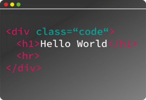
🧱 Basic Grid Setup
html
<div class="grid-container">

  <div class="item">1</div>

  <div class="item">2</div>

  <div class="item">3</div>

</div>
css
.grid-container {

  display: grid;

  grid-template-columns: 1fr 1fr 1fr;

  gap: 20px;

}
Result: 3 equal columns with 20px gap.
📐 Defining Columns and Rows
css
.grid-container {

  grid-template-columns: repeat(3, 1fr); /* 3 equal columns */

  grid-template-rows: auto 200px;        /* 2 rows */

}
Units you can use:
px,em,%– Fixed or relativefr– Fraction of available spaceauto– Size to contentminmax(min, max)– Responsive sizing
📍 Positioning Items
Named grid lines:
css
.item {

  grid-column: 1 / 3;  /* span from column line 1 to 3 */

  grid-row: 1 / 2;     /* stays in first row */

}
Or shorthand:
css
.item {

  grid-area: 1 / 1 / 2 / 3;  /* row-start / column-start / row-end / column-end */

}
🧭 Grid Auto Placement
Don’t need to manually place everything:
css
.grid-container {

  display: grid;

  grid-template-columns: repeat(auto-fit, minmax(150px, 1fr));

}
✅ This creates a responsive grid that auto-adjusts columns based on screen size.
🔁 Grid Gap
css
grid-gap: 20px;
Or:
css
row-gap: 10px;

column-gap: 30px;
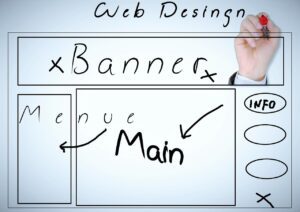
🧩 Named Areas (Optional)
css
.grid-container {

  grid-template-areas:

    "header header"

    "sidebar main";

  grid-template-columns: 1fr 3fr;

}
.header { grid-area: header; }
.sidebar { grid-area: sidebar; }
.main { grid-area: main; }
🧠 CSS Grid vs Flexbox
| Feature | Grid | Flexbox |
|---|---|---|
| Layout | 2D (rows + columns) | 1D (row or column) |
| Use Case | Page layouts | Navbars, cards |
| Auto placement | Powerful | More manual |
| Complexity | More control | Easier for small UI parts |
🎯 Real-World Use Cases
Responsive blog layouts
Image galleries
Complex dashboards
Admin panels
Product listings
📚 Resources
✅ Summary
| Property | Use |
|---|---|
display: grid | Enable grid |
grid-template-columns | Define columns |
grid-template-rows | Define rows |
grid-area, grid-column, grid-row | Position items |
gap, row-gap, column-gap | Add spacing |
grid-template-areas | Name and arrange sections |


